
Role: UX Researcher, UX Designer, Visual Designer
Duration: Jun 2022 - Sept 2022
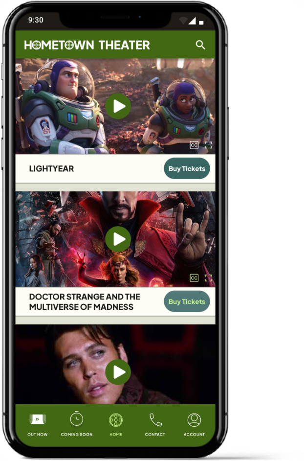
The Challenge: Design a movie trailer viewing app for a movie theater.
The Goal: Create a simple, accessible interface that allows users to watch real movie trailers and make ticket purchases quickly.
Target Audience:
Adults 18-65
Moviegoers of all ages
Challenges and Constraints
Budget
Trailer viewing sites like YouTube often have fake or fanmade trailers
User Research
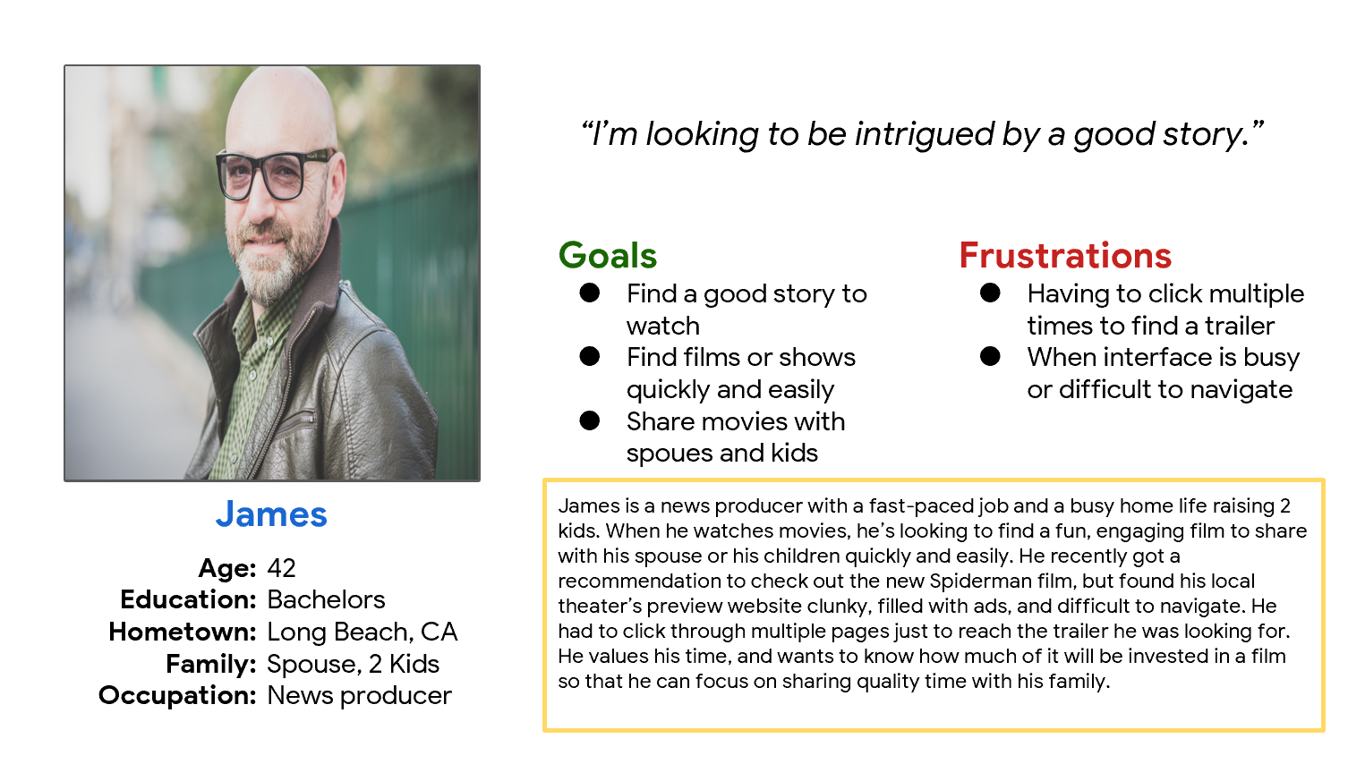
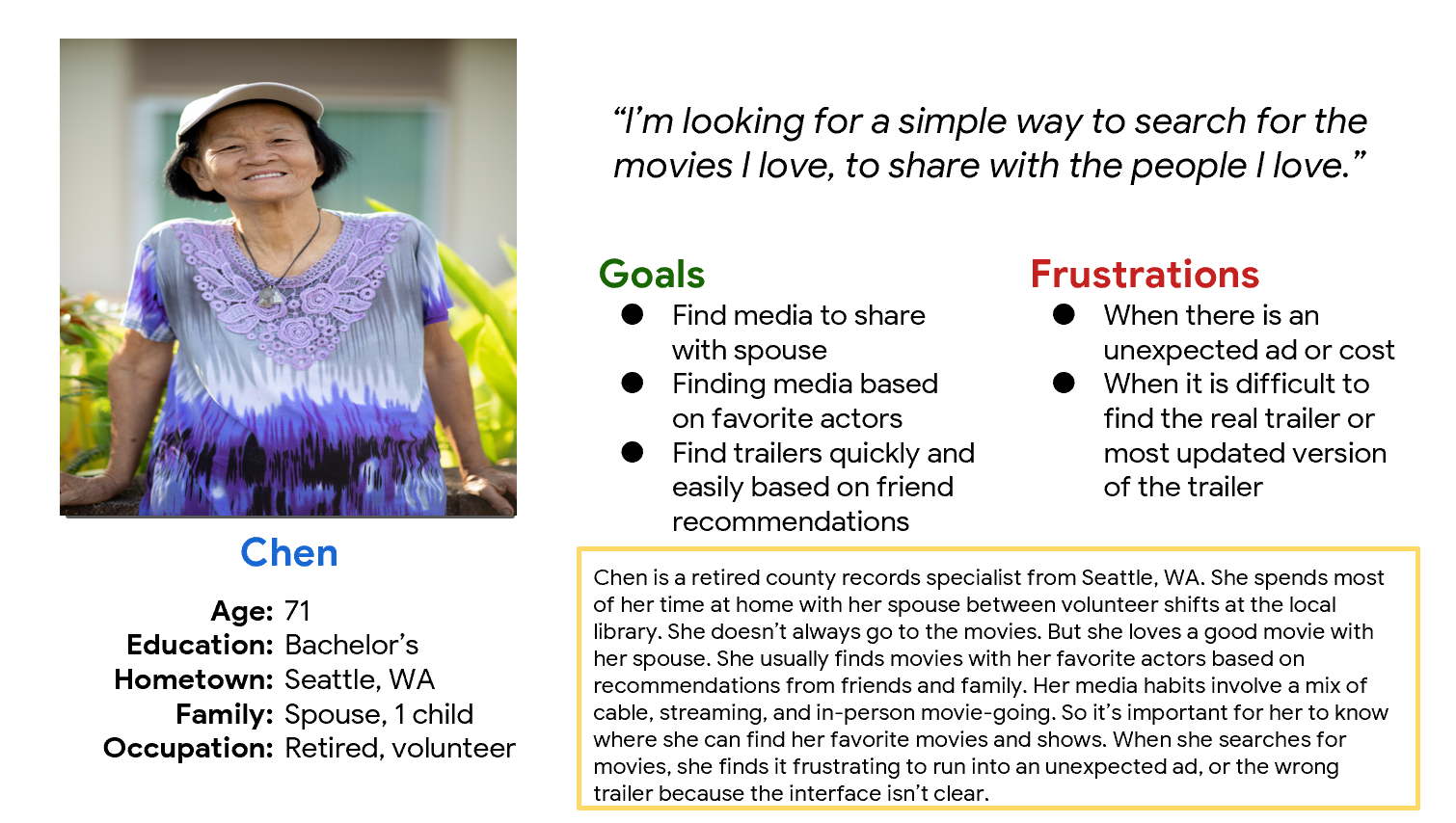
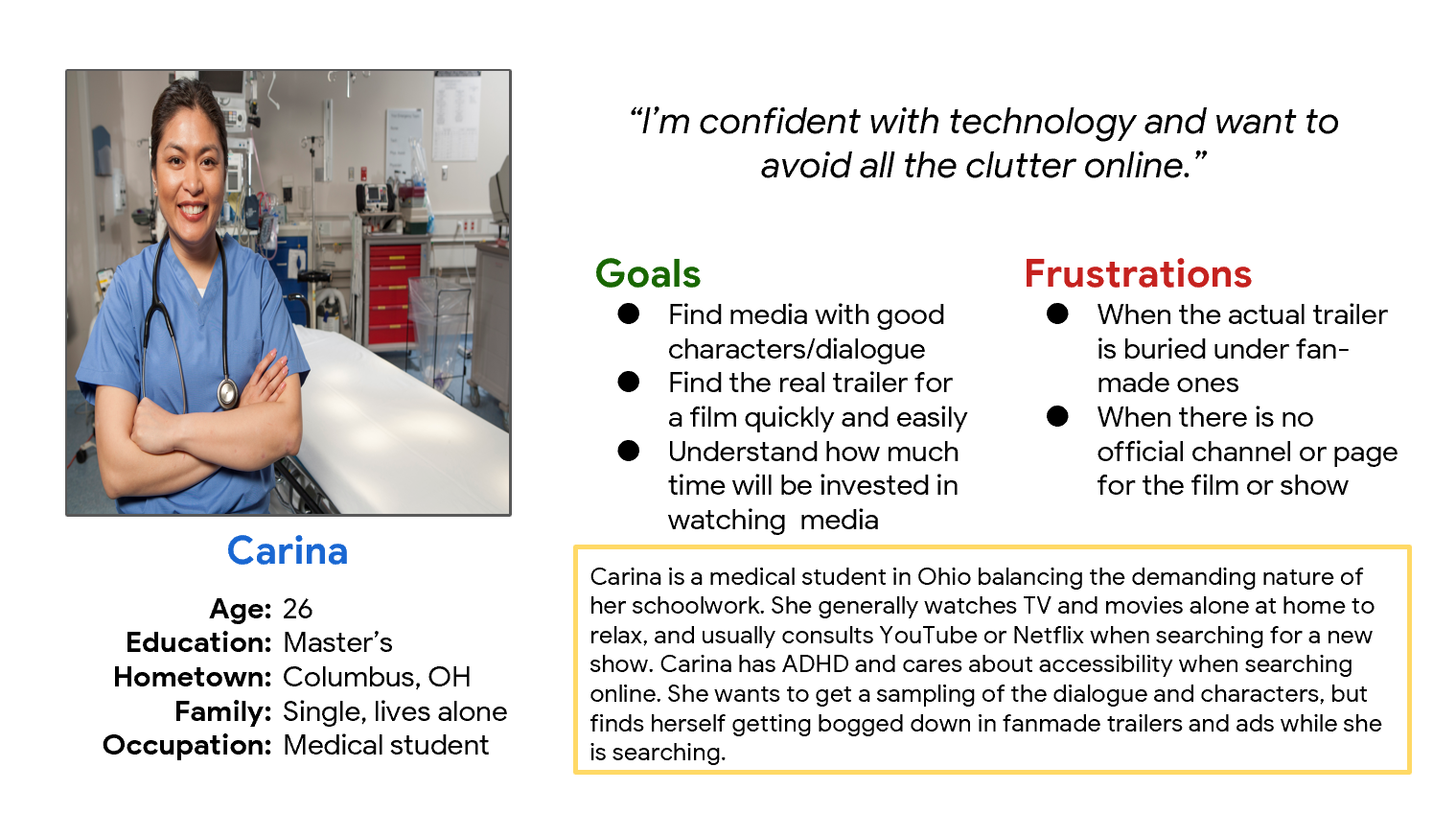
I wanted to learn how more about movie watching and trailer viewing habits. So I conducted 6 user interviews with 4 men and 2 women aged 18-70. Each interview participant was asked about their moviegoing habits, as well as their experience finding and watching movie trailers. Users were frustrated with the frequency of fake trailers on sites like YouTube, and had difficult with sites where advertisements interrupted the viewing process.
“I felt foolish sharing a trailer and figuring out that it isn’t even real.”
Meet the Users
Defining the Problem
Through my research I determined that users needed a quick, simple interface that let them watch real film trailers, then make ticket purchased. This research led me to prioritize 2 key features in the design:
A native video player interface, rather than pulling from other sites like YouTube
Making the trailer viewing process front and center, so users can start watching trailers with one tap.
Let’s Get Sketching
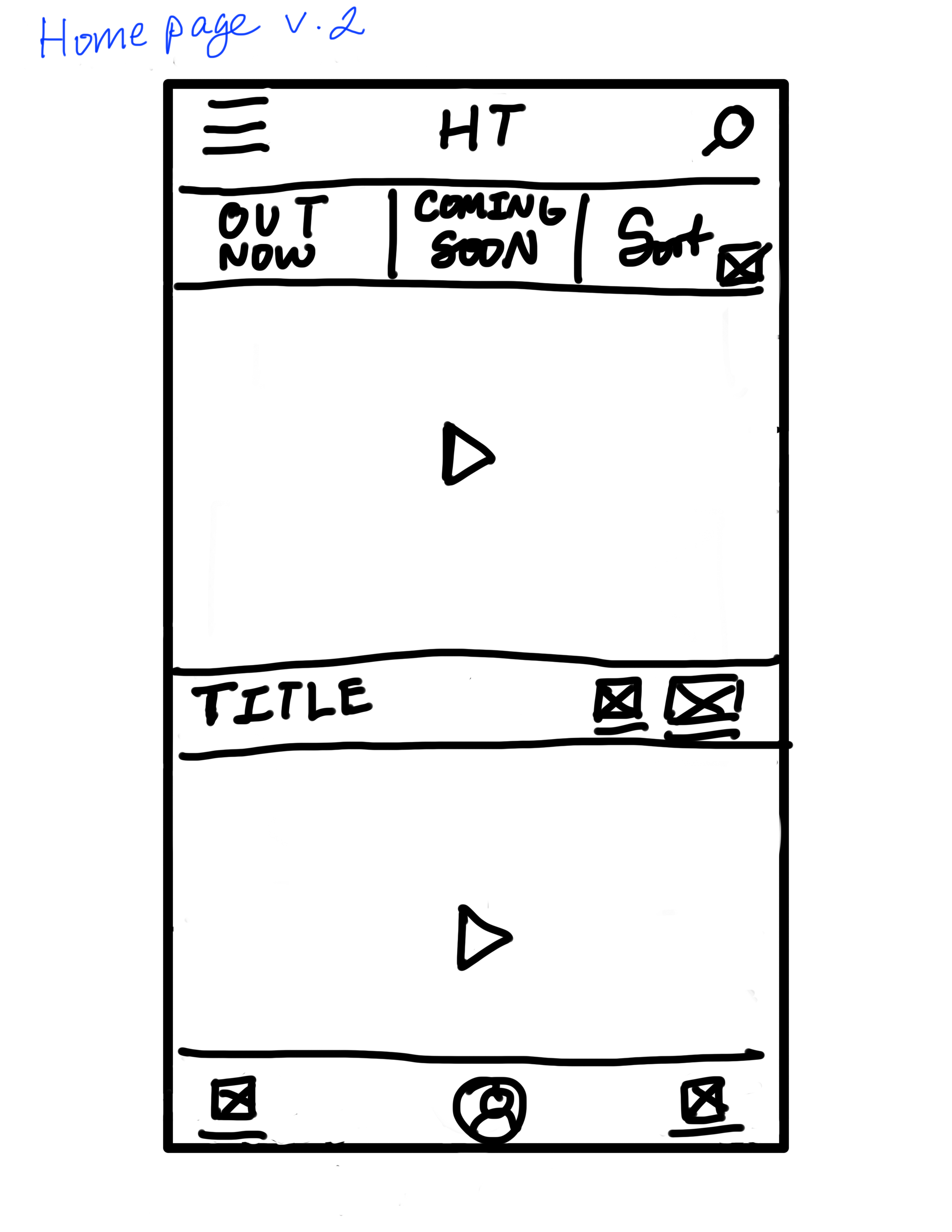
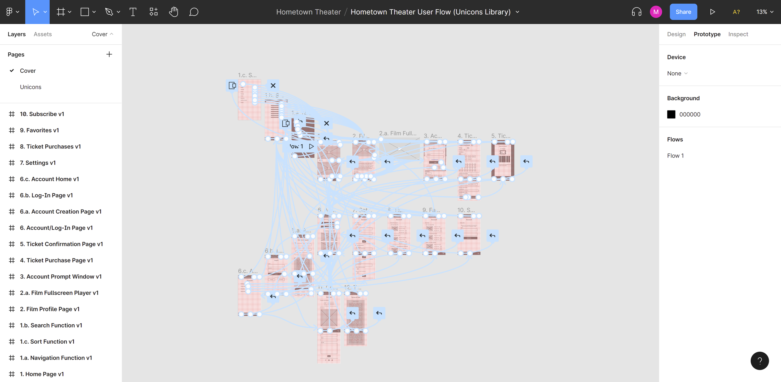
I worked out the primary user flow for the app, and starting sketching wireframes and storyboards based on my research.
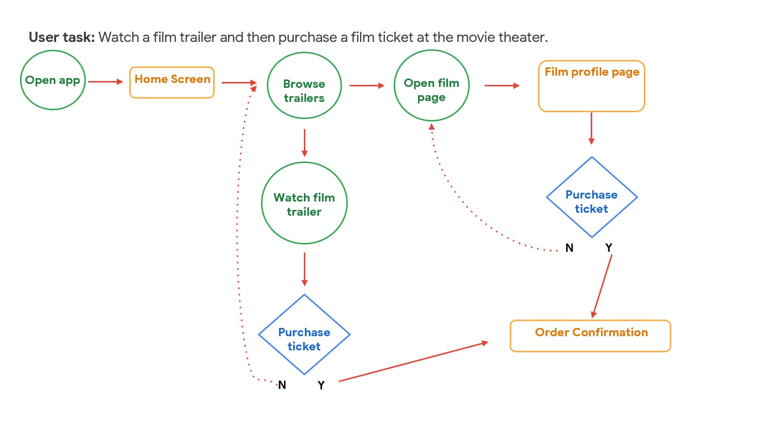
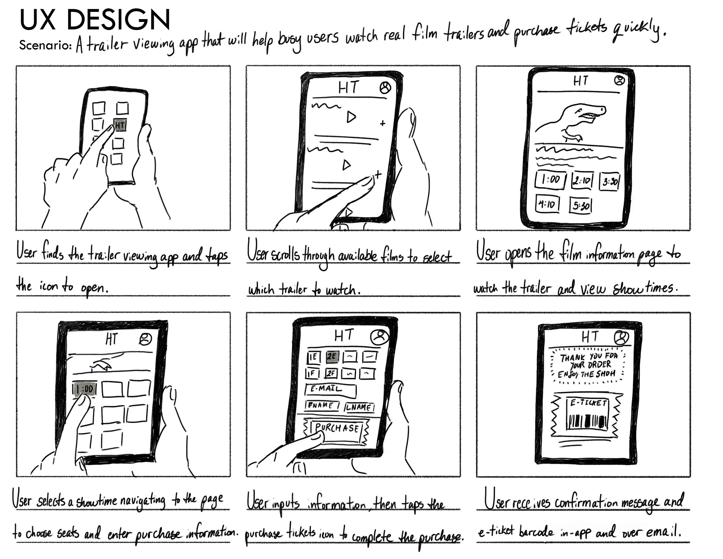
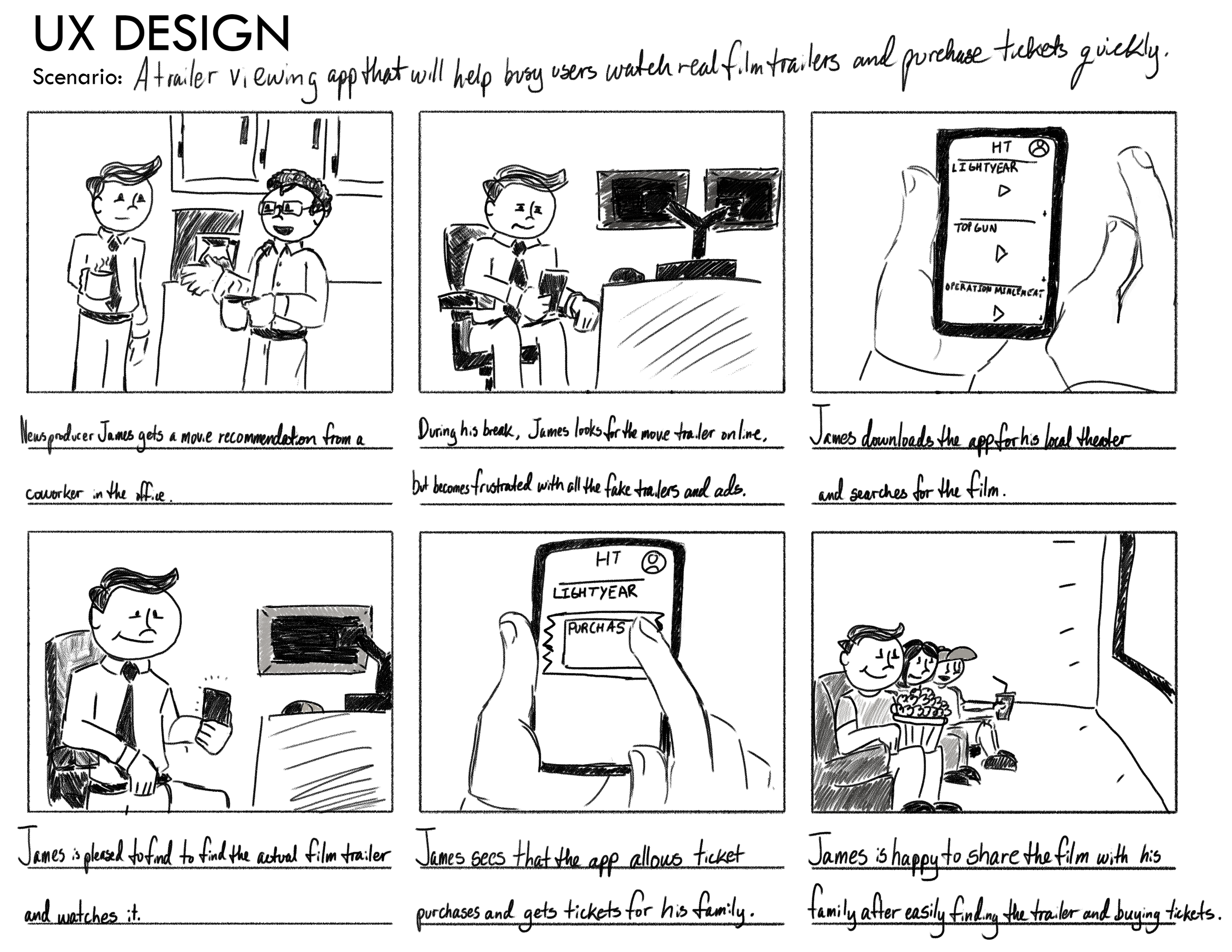
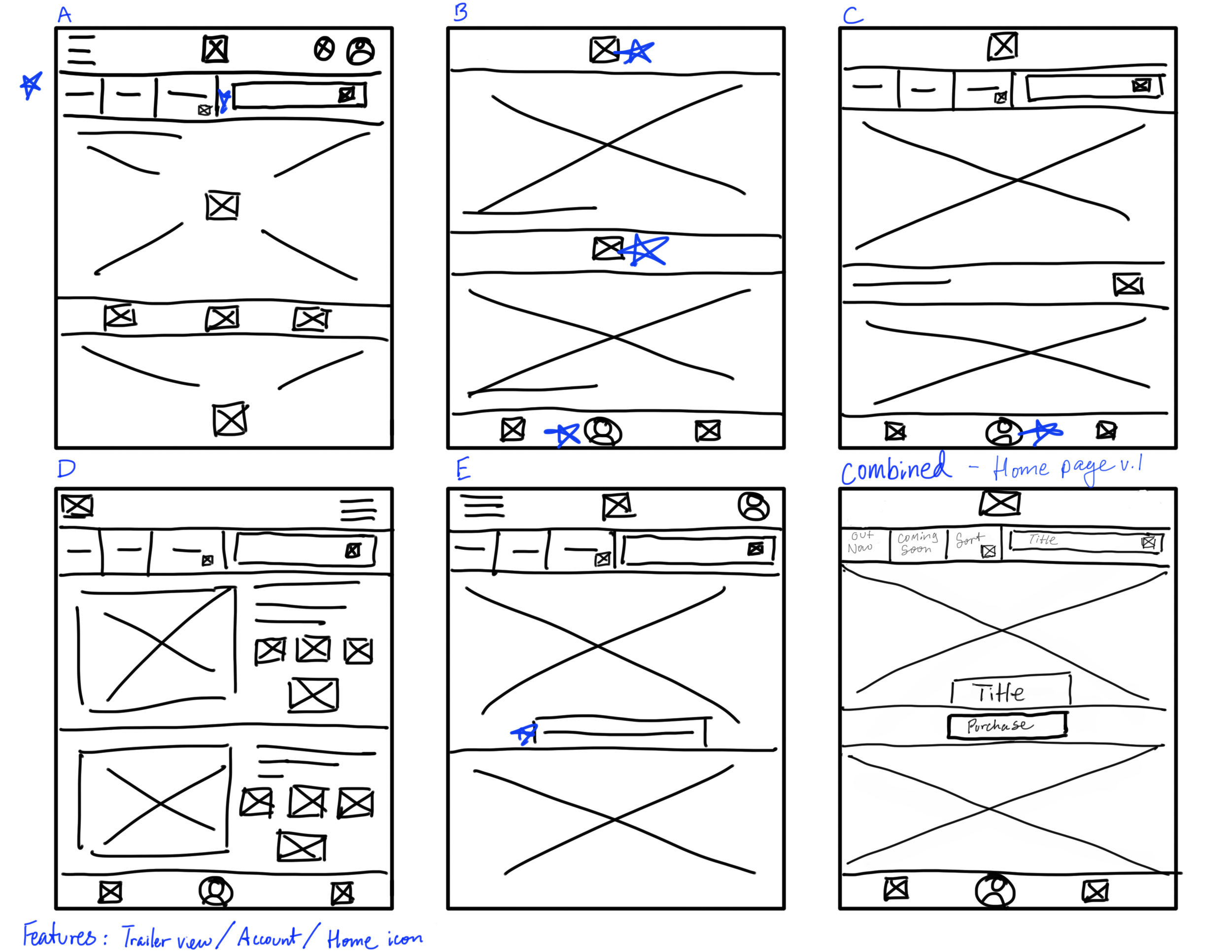
Wireframing and Prototyping
Round 1 - Digital Wireframing and the First Prototype
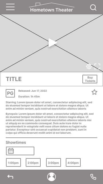
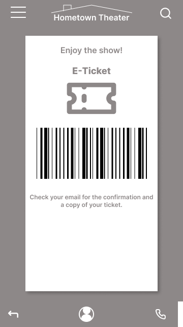
I got a good feel for how the home page should look based on chats with users. With that, I started wireframing in Figma to test these early concepts.


Round 2 - User Testing
After creating the first prototype, I conducted a remote moderated usability study with 5 participants.
I wanted to test the core functions of watching a film trailer and completing a ticket purchase, as well as secondary functions like browsing for trailers or sorting through film genres. I gave each participant a series of prompts within the app, and measured success using the following metrics:
Time on task (how long it took to complete a ticket purchase)
Conversion rate (what percentage of participants actually finished the task)
System usability scale (to get a sense of what participants felt about the app overall)
Findings
No participant found the full-screen trailer viewer, a key function for the app.
So I added a full screen button to the video viewer on the homepage.
Each participant felt that the sort button actually worked more like a filter. I renamed the button to reflect its function more accurately.
Round 3
My next step was putting together a mockup that reflected these changes. I started with a colour scheme that I absolutely loved, based around Bright Yellow Crayola. It was a warm, fun orange that reflected the mock movie theater I was developing for - a local theater that valued placing the comforts of home at the center of the movie-watching experience.
I even made a splash screen animation in Figma to start building my visual design skills.

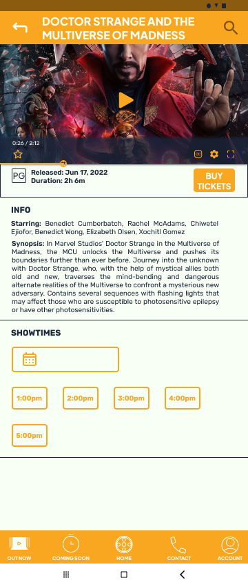
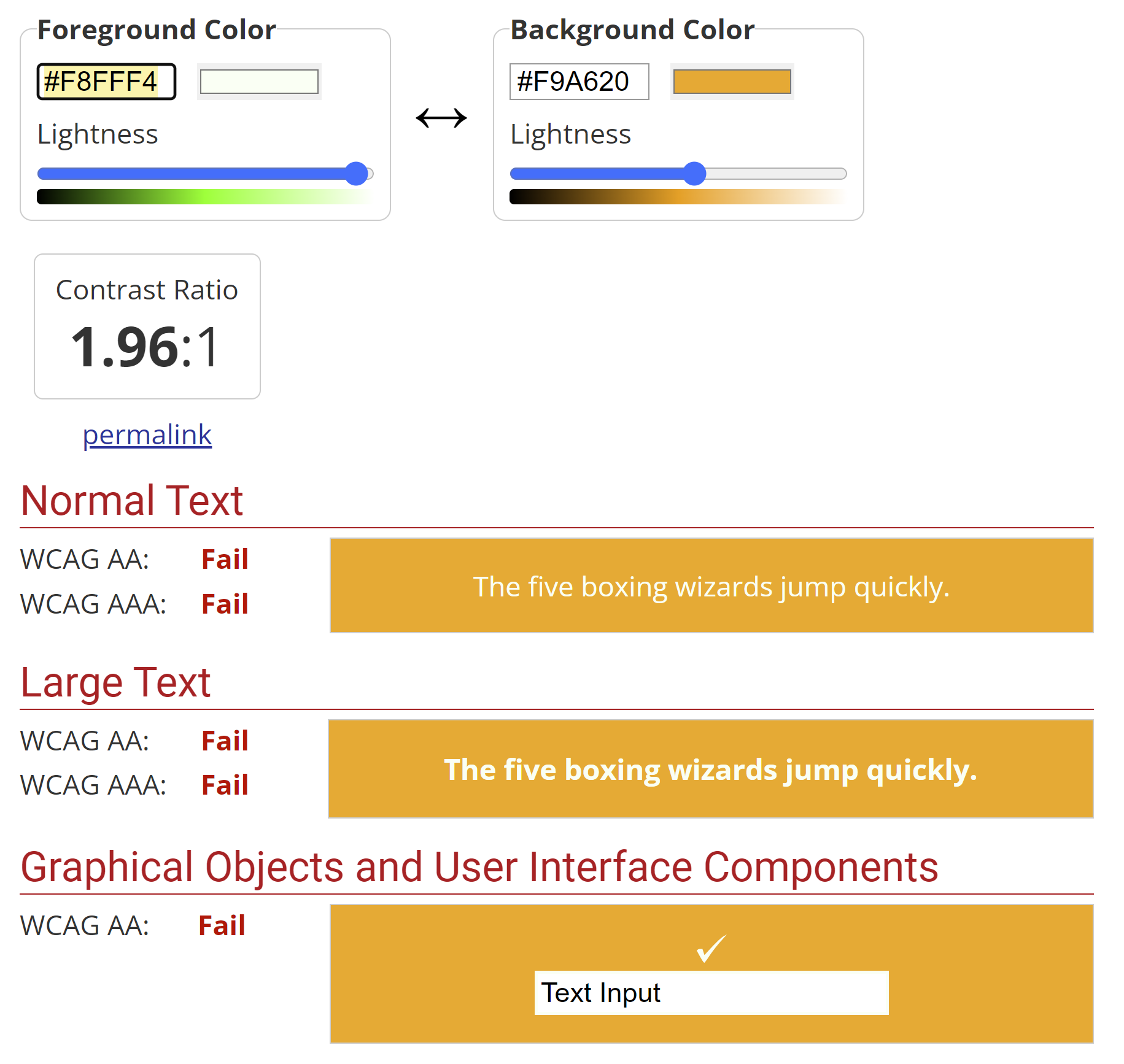
However, this colour scheme failed literally all of the WCAG accessibility guidelines. Lesson learned.
The Final Design
At this point, I had learned more about design systems, and began experimenting with Google’s Material Design to develop a more accessible colour scheme. I shifted to more earth tones and cooler greens, since I was going for an aesthetic that evokes home comfort. And these colour are often found in interior home designs.
I also used Google’s Material Design icon library as the basis for customized icons, shown in the sticker sheet near the bottom of this page.
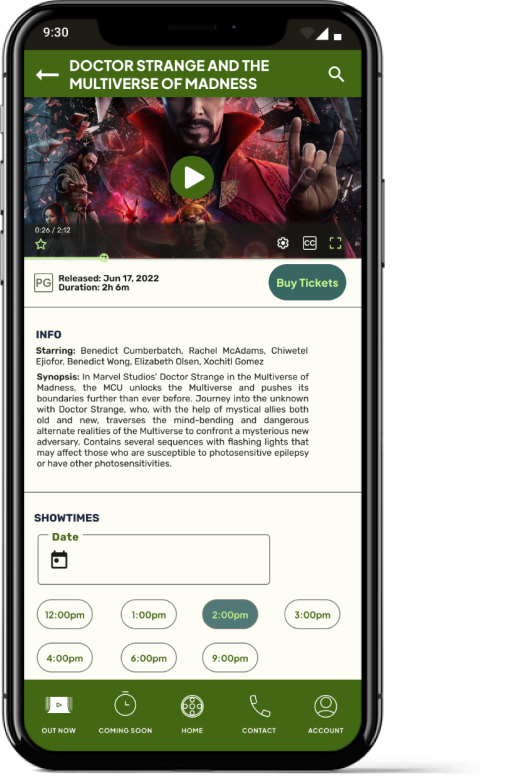


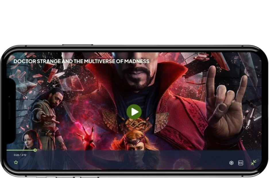
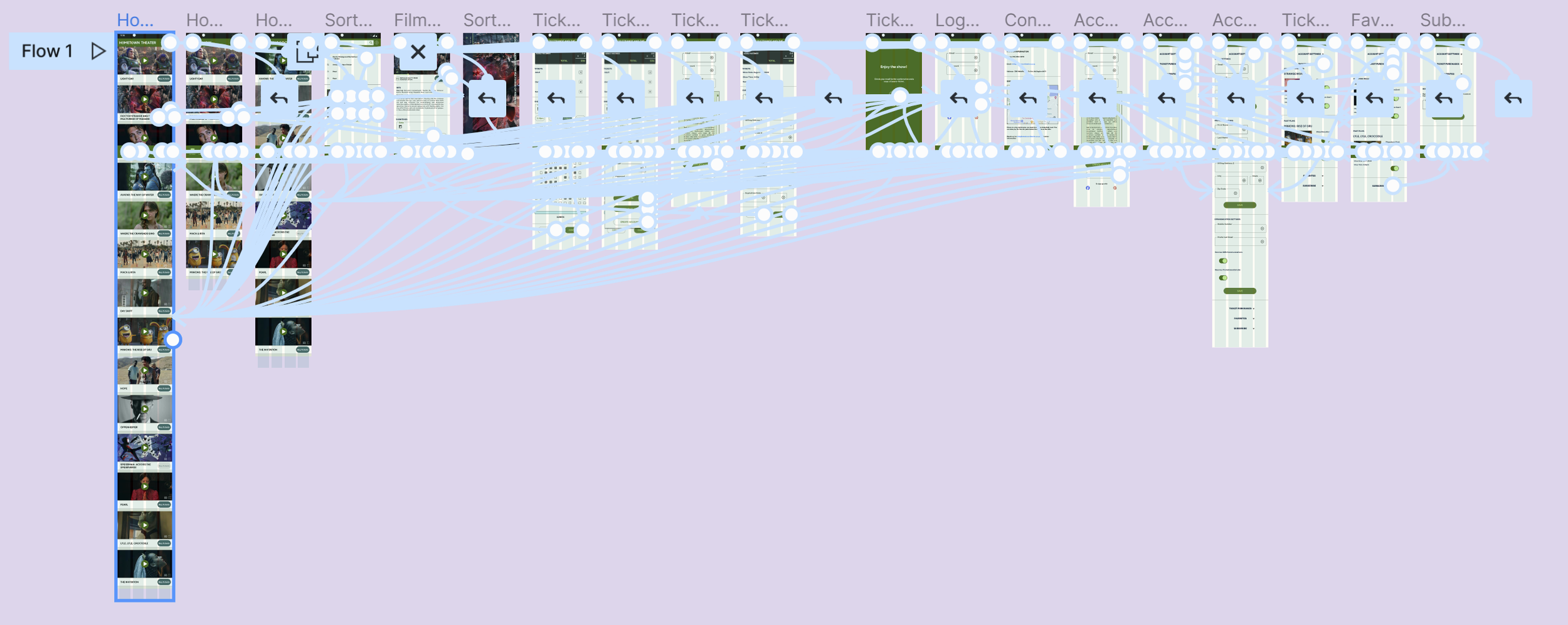

The final design employs rightward motion to communicate progression through the user flow. This design also uses a bottom navigation bar, removing the need for the original navigation menu, “Out Now”, or “Coming Soon” buttons featured in the initial prototype. The colour scheme is adaptive and passes the WCAG contrast guidelines, allowing for a more accessible interface. Buttons are also labeled with text to be more accommodating to screen readers.
Additionally, the “filter” function has been incorporated into the search feature, making the overall interface simpler and more elegant.
Conclusions
One of the most important things I learned throughout this process is the necessity of a coherent design system. I am still building my visual design skills, in particular using colour to communicate place and navigation cues. Incorporating a developed design system like Material Design was a big leap in that regard.
I also learned how critical it is to make accessibility an important consideration at each design stage. I loved my initial colour scheme, but would have saved loads of time and effort by checking the WCAG contrast guidelines beforehand.
Next Steps
As I build out this design I would prioritize these design updates:
Incorporating more movement into the search function so match the primary user flow
Review the design to ensure that it is compatible with screen readers
Develop a responsive website, since this would be for a movie theater in practice and would interface with the theaters webpage

