Role: UX Designer, Visual Designer
Duration: Sept - Oct 2022
In this 2-month project through Google’s UX Design Certificate program, I designed a responsive website featuring a core account transfer flow for a mock digital bank.
The Challenge: Design a transfer flow for an online bank.
The Goal: Create a transfer flow solution that streamlines the online banking experience while allowing users increased control and accessibility options.
User Research
Research Goals
Understand New Zealand consumer banking trends
Assess popular features and common user paint points with current online banking products
Find gaps in the online banking market to explore through design
Bank Notes
A recent New Zealand transplant, I’d started using the Bank of New Zealand (BNZ) for mobile and digital banking, but I had a limited network to conduct user research.
So I performed a competitive audit of New Zealand’s top banks, as well as some similar business that offer online transfers:
ANZ
ASB
BNZ
Westpac
TSB
Paypal
Western Union
Wise
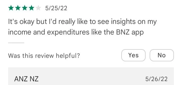
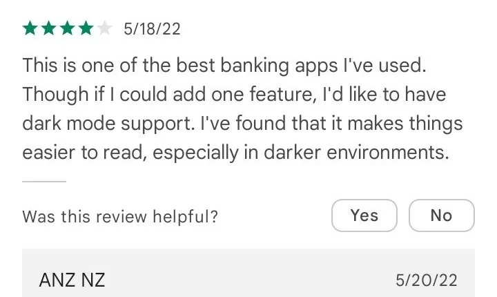
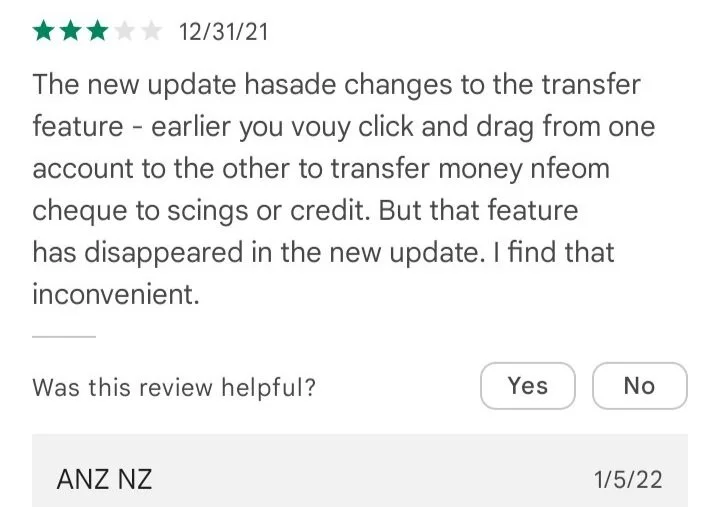


A survey of banking app reviews revealed that users enjoyed drag and drop transfers, and holistic account information. Additionally, user pain points included customer service issues, as well as the lack of a dark mode.
This survey tracked with existing online sources, which indicated that convenience and customer support were among the most in-demand features for banking consumers.
Of New Zealand’s major banks, BNZ had high ratings for its online services and tools. However, TSB maintains a consistently high rate of customer satisfaction in New Zealand. I used these two organizations as key baselines for my own designs, with the goal of either expanding on or streamlining their design solutions to the same challenge.
Research Conclusions
My transfer flow design would need to focus on maintaining a holistic view of finances while allowing for simple transfers
Accessibility options would need to be a key focus once users log into the banking interface
Quick access to customer support would be an essential secondary feature
To the Drawing Board
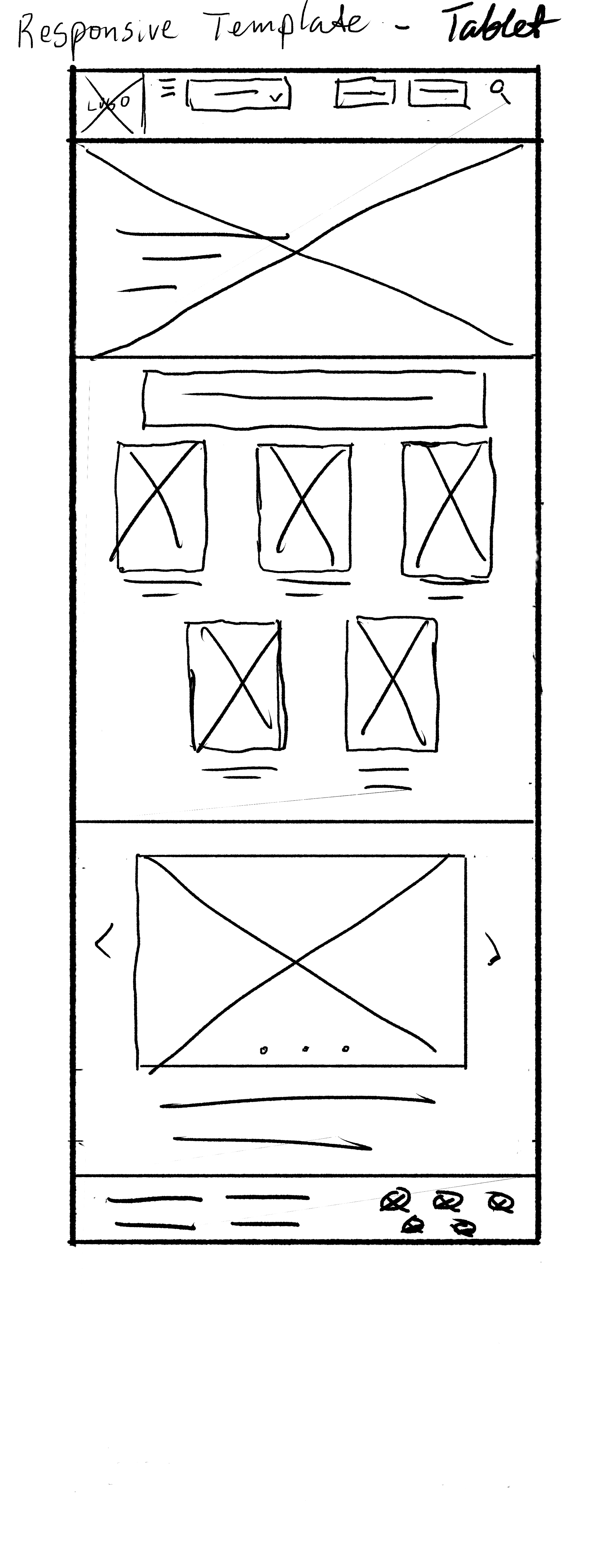
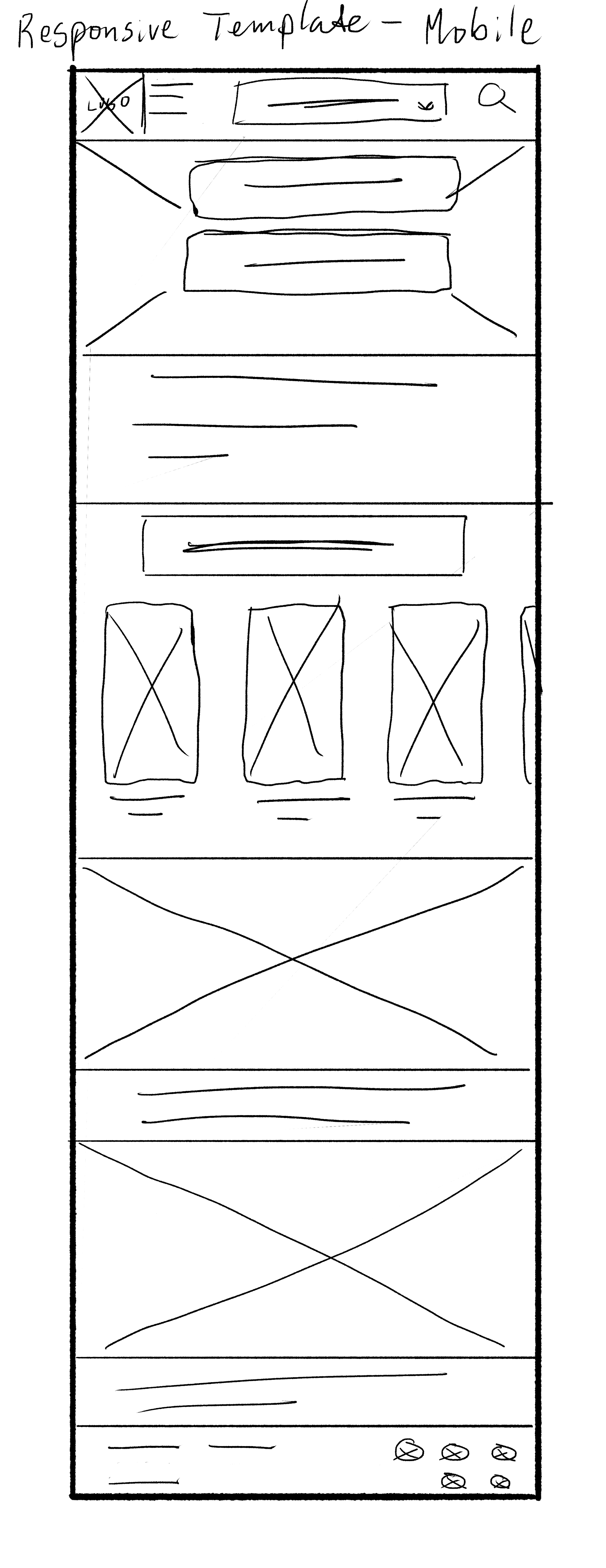
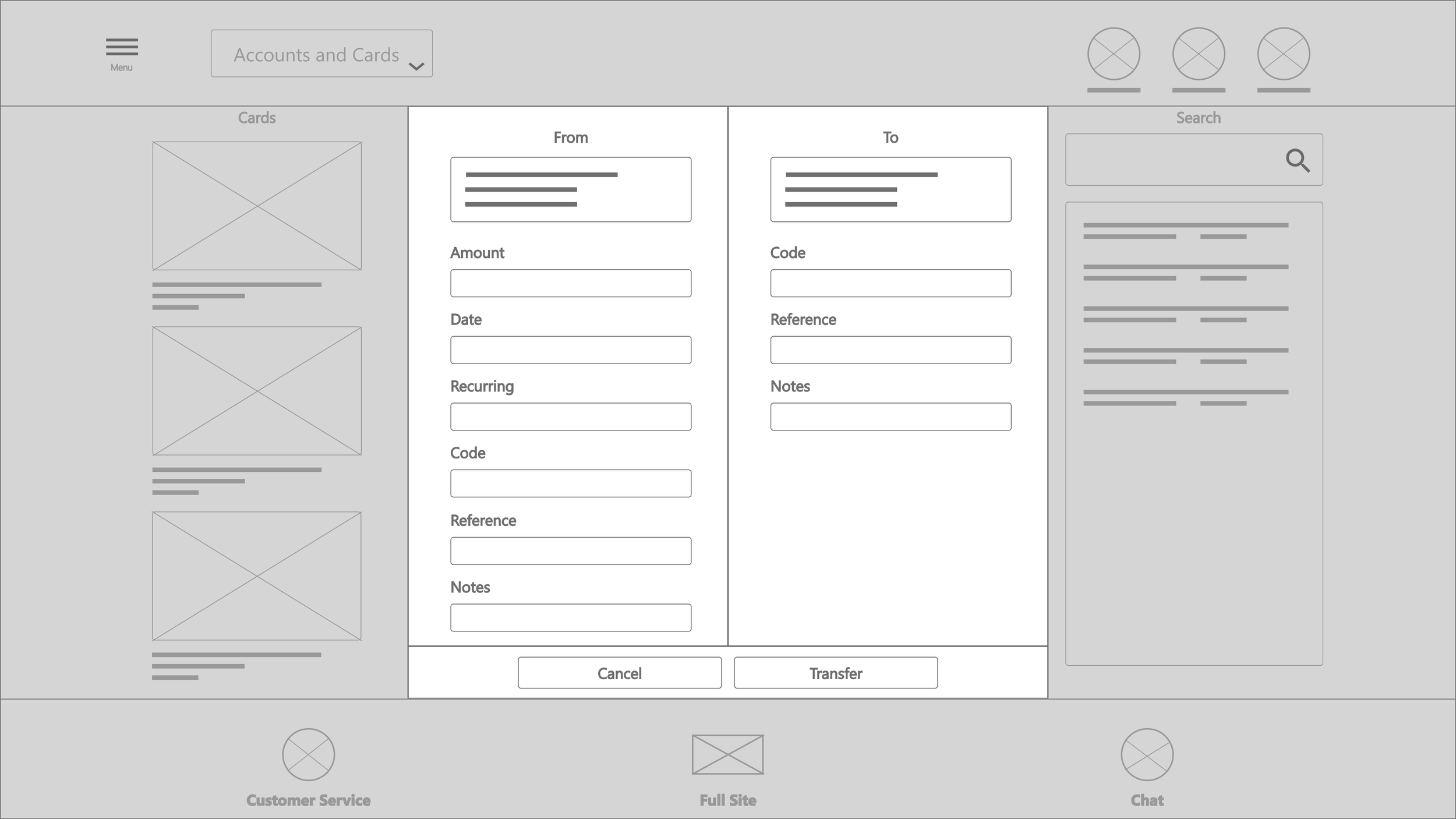
I started the ideation process with sketches and wireframes. The goal was to practice plotting a responsive website, so I prepared for both desktop and mobile devices.
Site Map

I wanted to build my information architecture skills and started with developing two site maps, one for the main site, and another for when the user logs in.
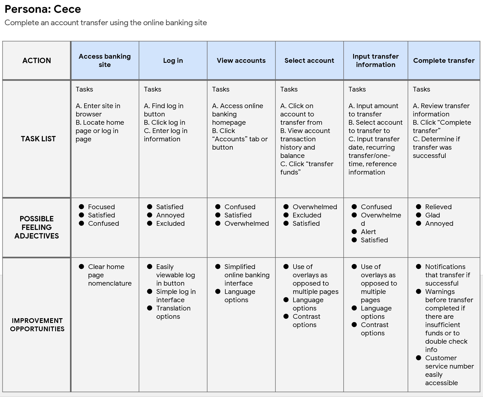
Journey Maps
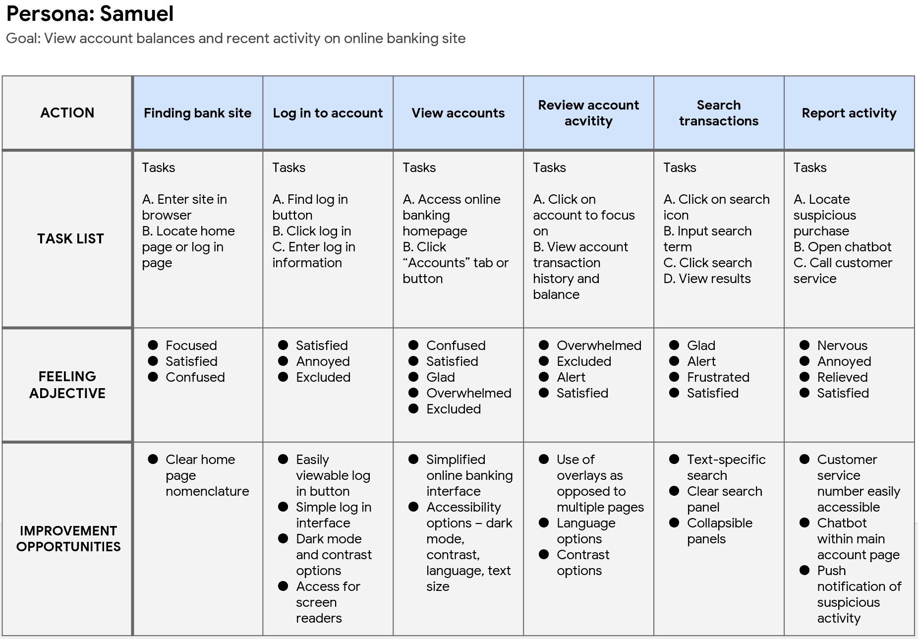
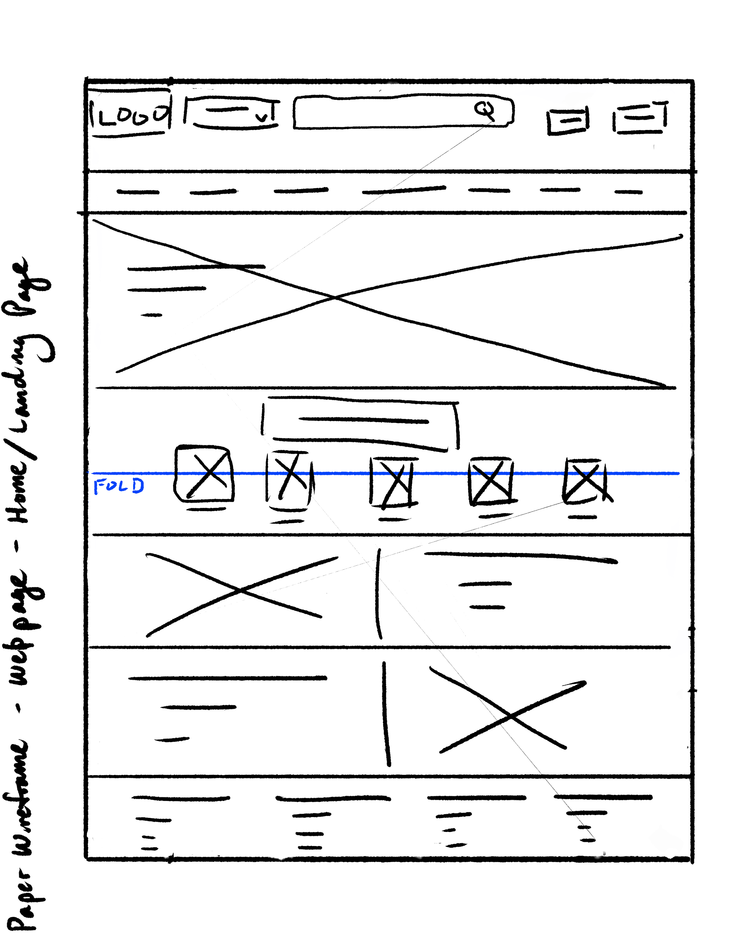
Paper Wireframes
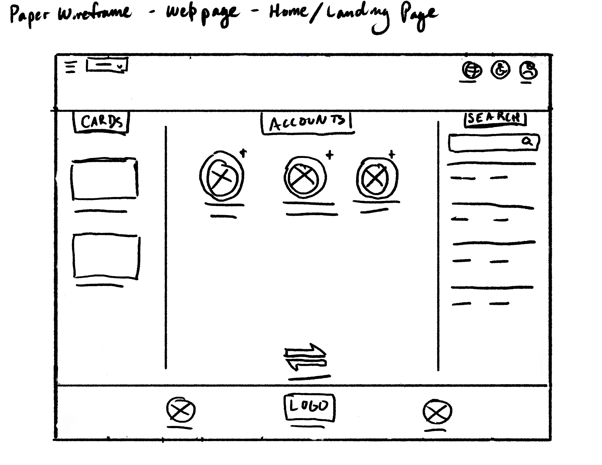
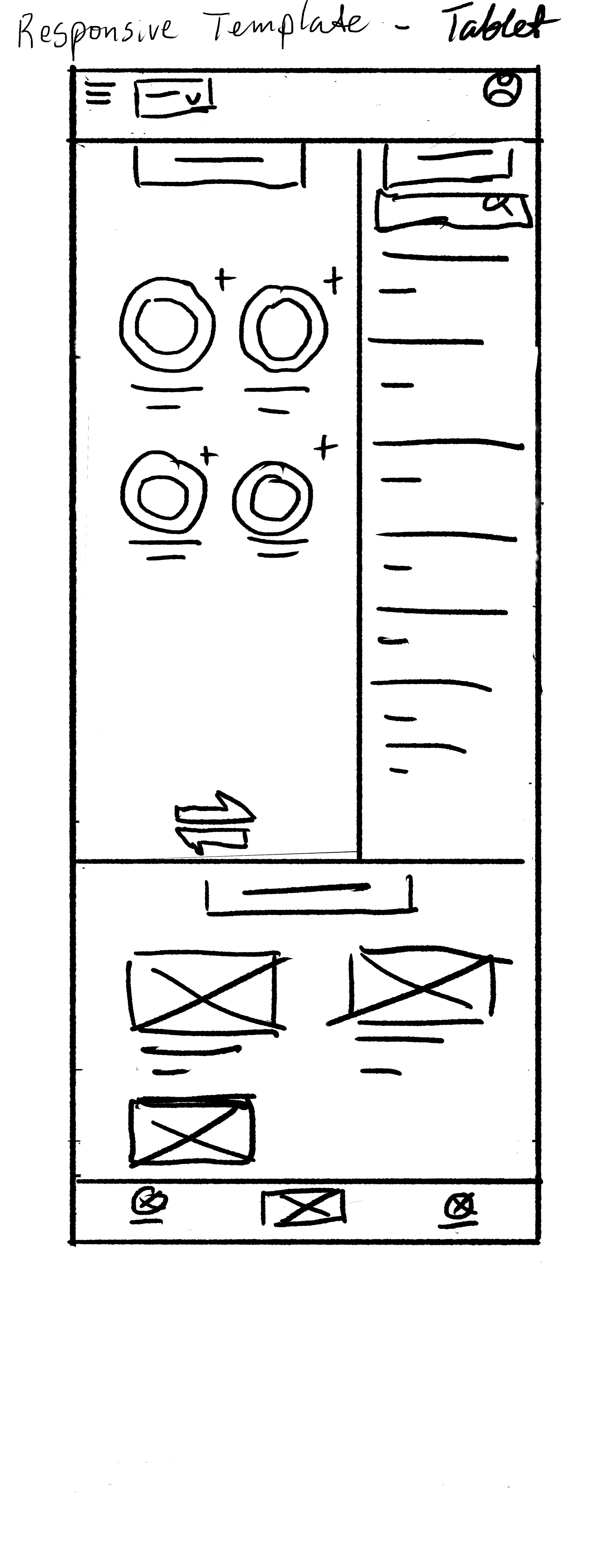

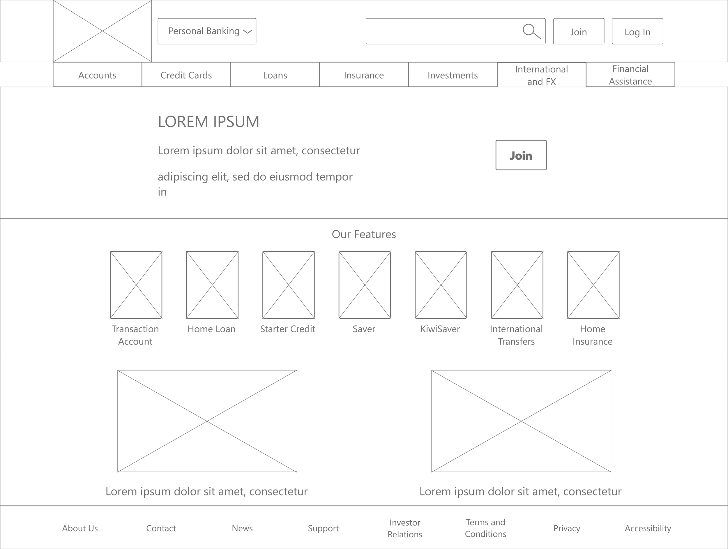
Digital Wireframes


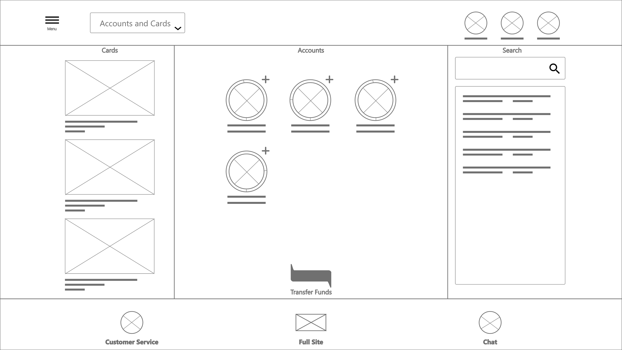
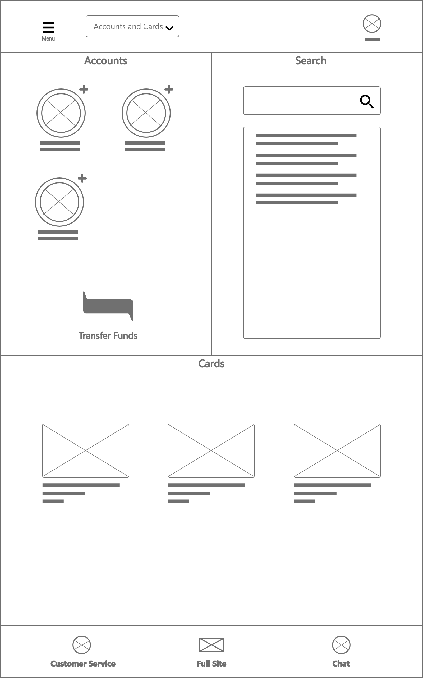
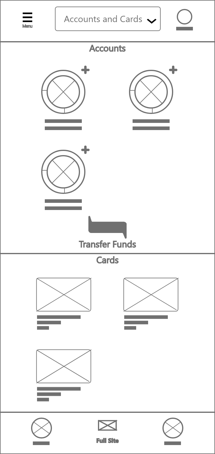
Prototyping
Round 1
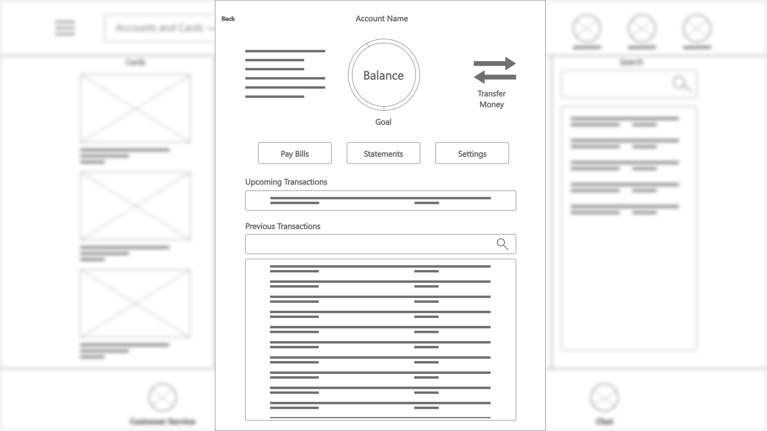
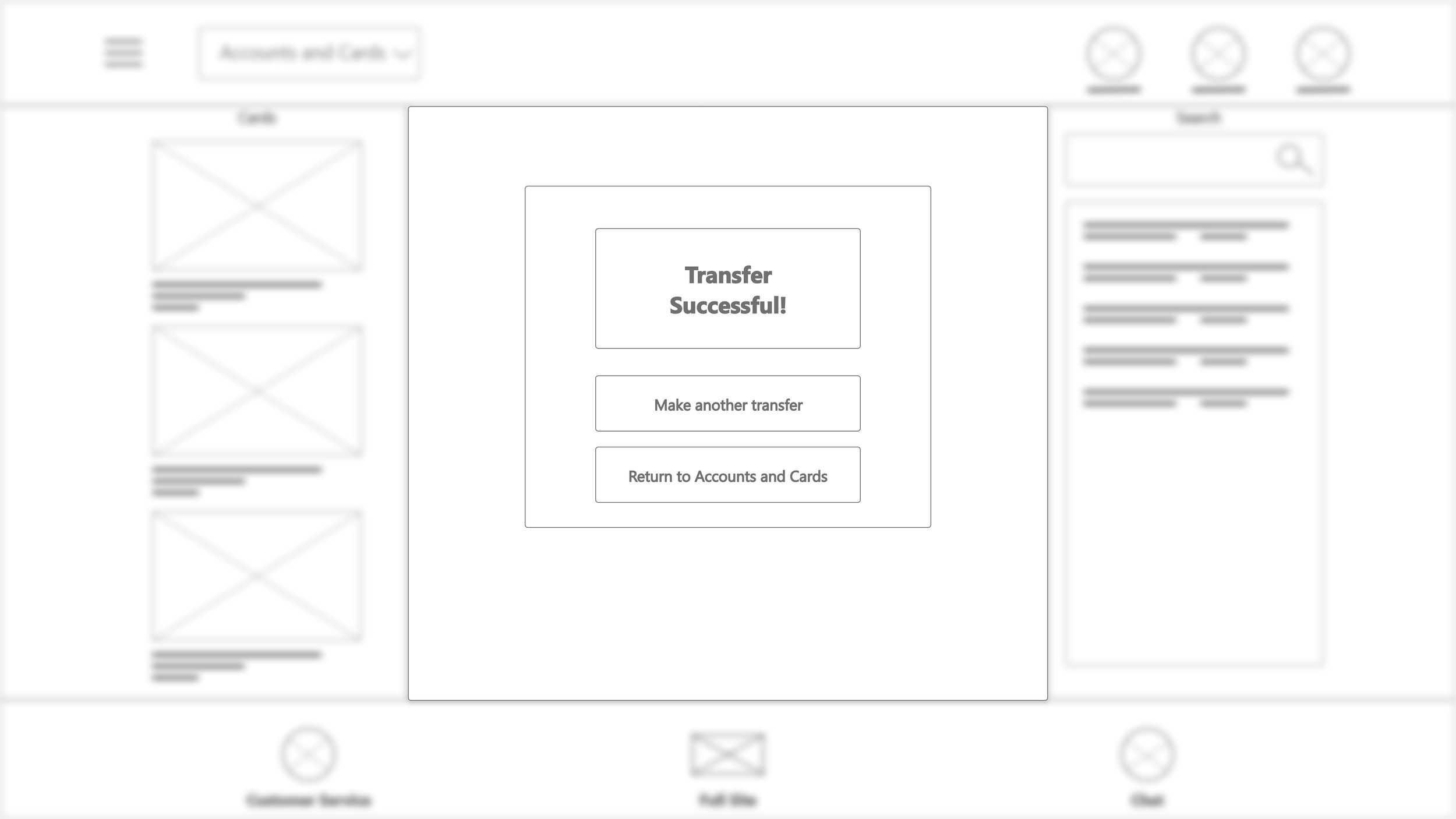
I originally wanted to use motion to communicate progression. My initial prototype of the transfer flow used overlays that slid up over the landing page once the user initiated a transfer. These hammered out a working user flow, but were imprecise based on user feedback.
I worked out another prototype that used a set of centered overlay windows to perform the primary functions within the app. These overlays transitioned using dissolves rather than sliding. This technique was similar to existing transfer flows, such as the system BNZ uses. Though I worked on expanding that system’s functionality while maintaining a clean interface.
Round 2

The Final Design
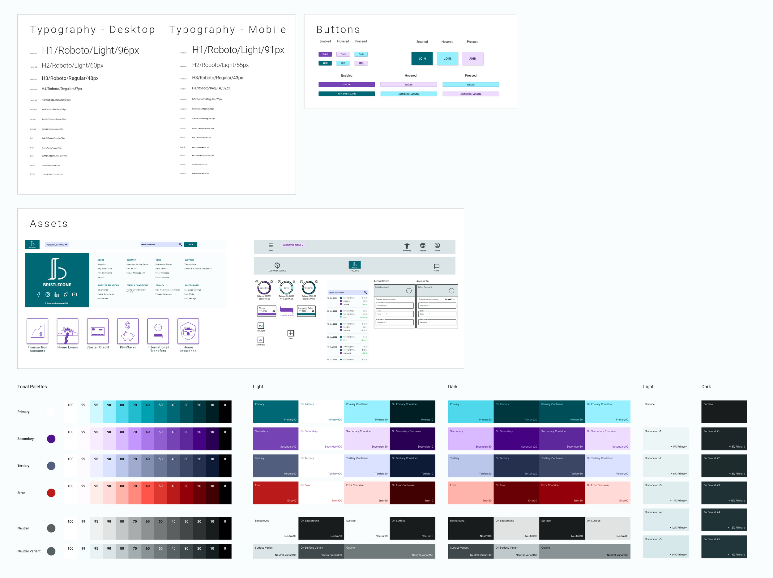
I built on my experience with design systems, incorporating customized icons from Google’s Material Design and Adobe’s UI kit, while relying on Adobe XD’s excellent variant system. Because Adobe XD allows users to create and edit component states quickly and easily, I was able to create atom components for my site without having to craft extensive overlays.
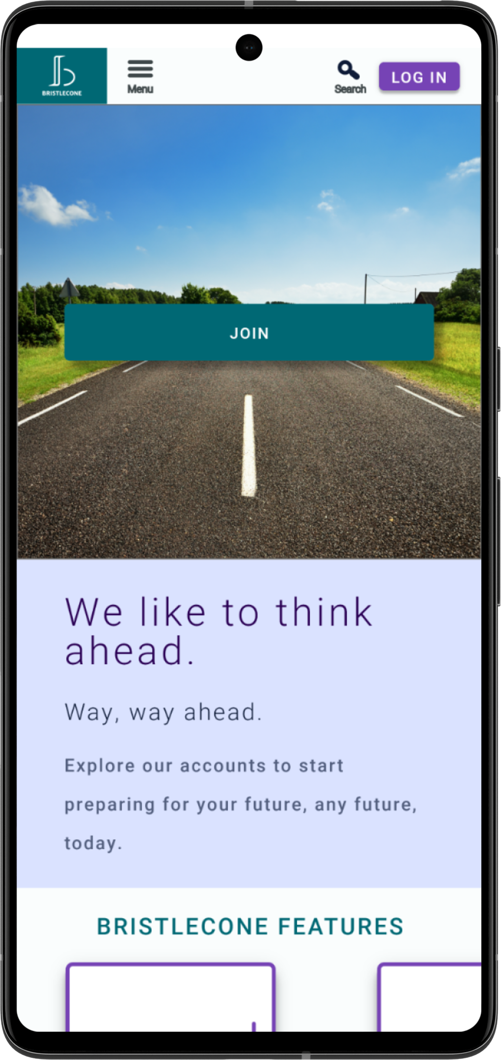
The result was a dynamic, responsive website that included a quick transfer flow.

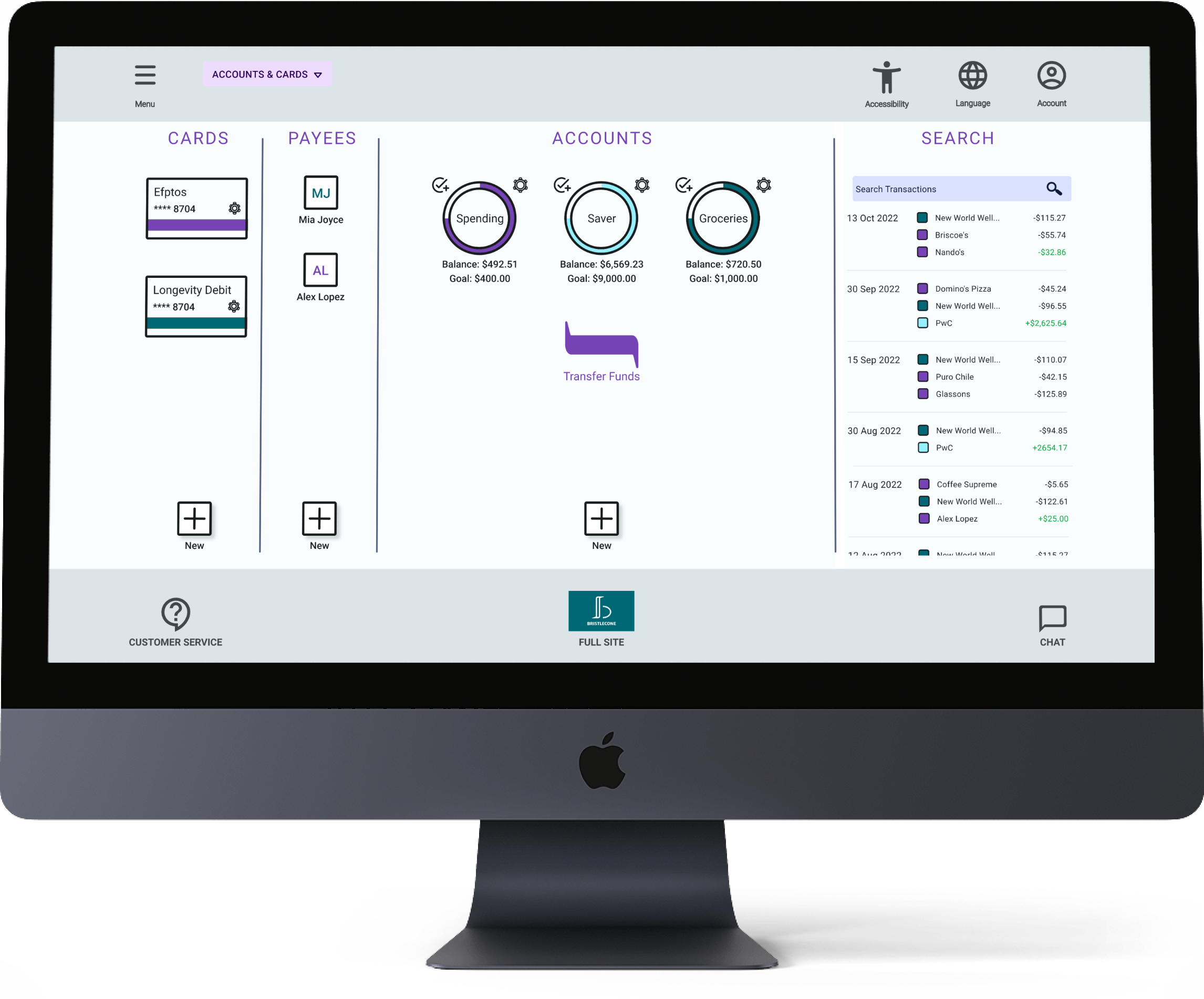

Once logged in, the account interface includes a holistic view of a user’s finances, much like BNZ. However, this design utilizes the full screen space to allow users to review recent purchases and manage cards quickly. My system envisions 3 core methods of entering the transfer flow:
Clicking on the transfer icon at the center.
Dragging one account icon to another.
Clicking on an account transfer link within the navigation menu.
Users can also initiate a transfer when reviewing an individual account as shown below:
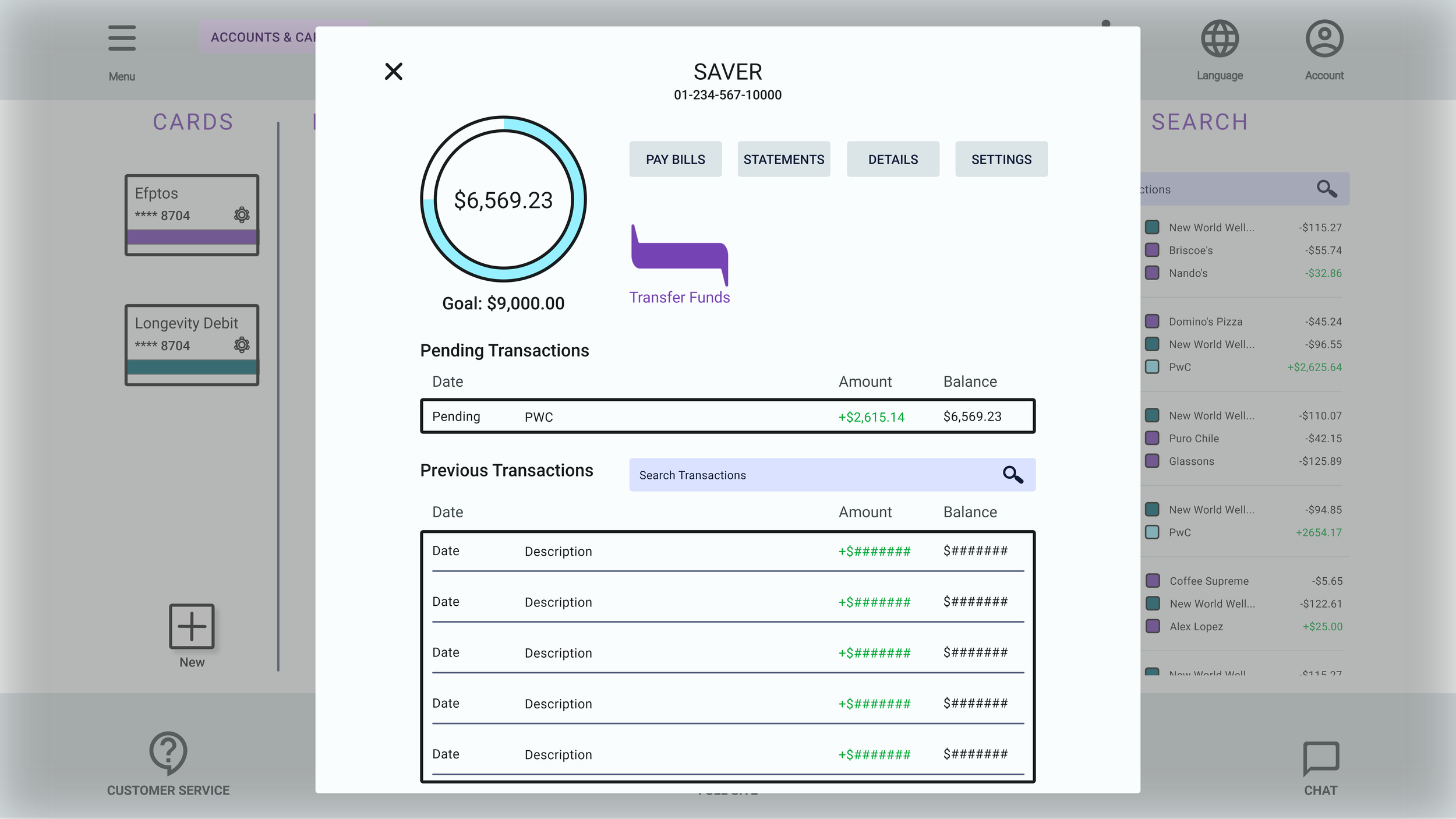

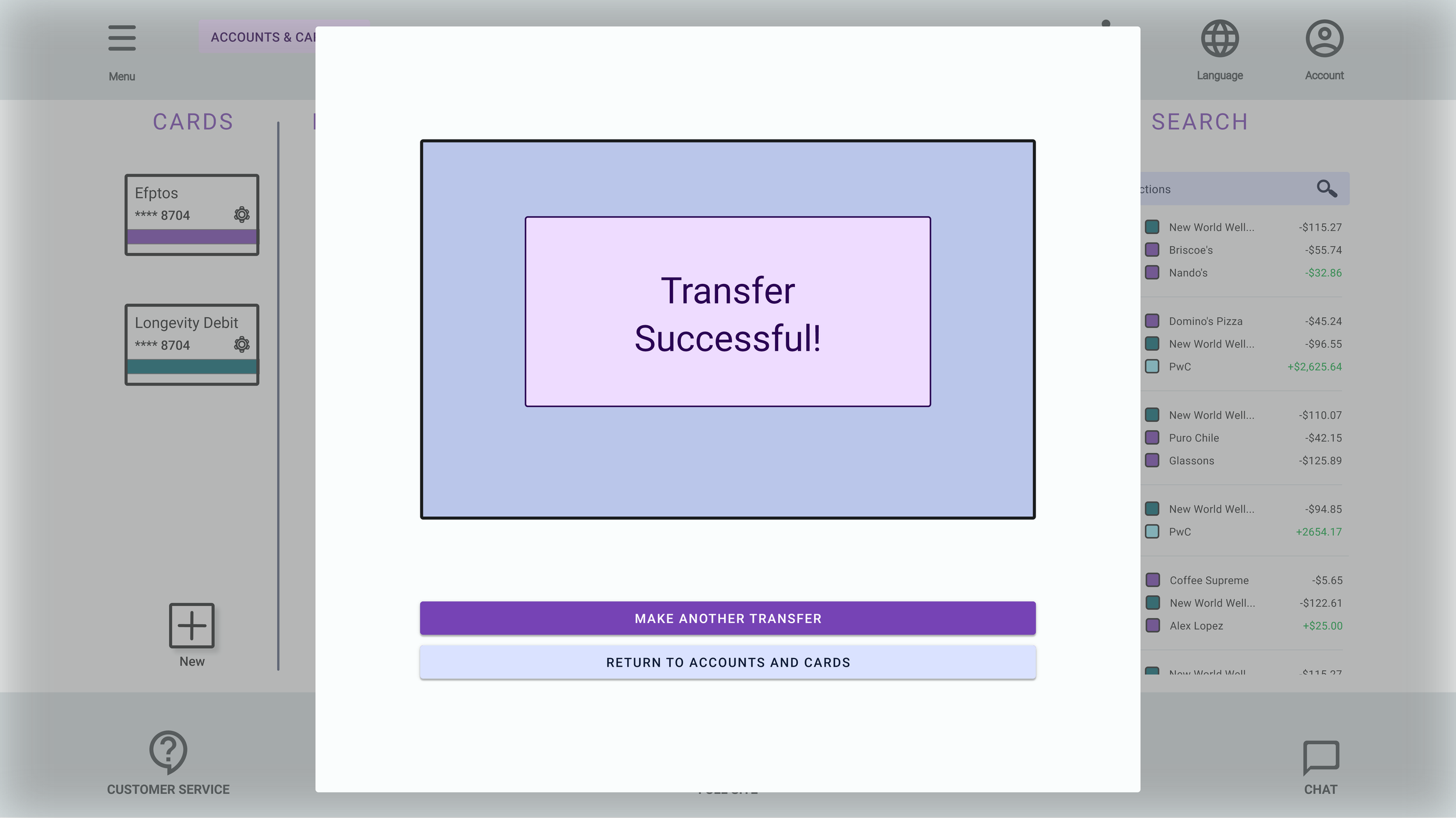
Additional features including setting savings goals, reviewing income and expenses, and reviewing payees and cards.
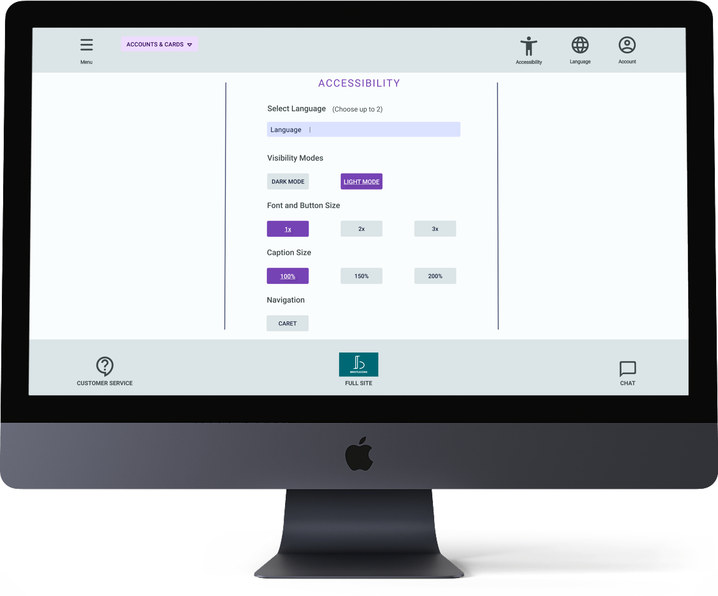
Finally, by clicking on the Accessibility Icon at the top, users can access expanded accessibility options, including toggling between light and dark modes, selecting up to 2 languages, and adjusting font size.
Conclusion
One of the key takeaways from this project was gaining some fluency with a new design tool: Adobe XD. Aside from adding a tool to my belt, this process allowed me to compare the programs I’ve used.
For example, I’ve found that Figma’s community and plugin connections allow for near limitless design flexibility. However, Adobe XD’s unique value offerings - like its copy and paste extraordinaire “Repeat Grid” and the intuitive variants feature - make it a powerful addition to any designer’s repertoire.
Next Steps
If I ever get a chance to return to this project, I’ve got a few ideas in mind to help build out its functionality:
Designing an account selection feature to add to the transfer flow to prepare for further testing
Develop bank card and payee controls
Work out of way of animating the prototype so that users can actually drag one account icon to another rather than simulating this function with a mouse drag
Conduct a more extensive usability study to determine additional pain points and new ways I could enhance the design

