Role: Experience Designer, Web Developer
Duration: Jan 2024 - Sept 2024
Over 130 Webpages, One Vision
In January 2024 I moved from the University of Otago Higher Education Development Centre to the university Library to lead the re-design of the Library’s Subject Guides system, a network of over 130 webpages helping 1000s of staff and students access Library resources.
Project Goals
Modernise the visual design
Create a template and design system to make existing content more usable while streamlining the development of future guides
Create a customised system with the Springshare platform, but in a way that is reproduceable and expandable for University of Otago Librarians
Challenges
Budgetary constraints
The University sector faces monetary pressures
Size of the system
The Subject Guides system hosts over 130 individual webpages
Range of stakeholders
The system has a large user base with widely varying needs
Dozens of staff Librarians interact with the system as a core part of their work
Design Discovery
After working with Deputy and Associate University Librarians to define project goals, I initiated 3 research efforts:
Primary Research
Consultation sessions with each of the Library sub-divisions, followed by a staff survey to help define project requirements
Interviews with 4 student users to gain a deeper understanding of the needs of the University’s core user base
Secondary Research
Situation analysis of the existing Subject Guides system, including trends among other similar universities:
Situation Analysis
I assessed the core pages of the previous system to understand its functionality.


I also reviewed the use of Subject Guides at institutions like Deakin University, the University of Auckland, the University of Queensland, and Victoria University of Wellington to gain a deeper sense of how other university Libraries apply this system:


Research Results
These research and engagement efforts yielded several key insights:
All users indicated that the system needed to be modernised, and integrated with existing University of Otago websites like the Home and Library webpages, similar to other universities like Deakin University
The information architecture would need to be restructured to make important resources like referencing information easier to find to assist students with research
Resources for Māori and Pacific students were difficult to access
The system needed to be streamlined to reduce cognitive load, while offering the Librarians flexibility to curate resources based on their expertise
“It’s a really interesting and handy thing, but it’s just so hidden.”
“I know what information I need, but I just don’t know how to get there, and that can be a bit frustrating.”
“It is just a bit vintage in the aspect that it’s out of touch with the rest of the University of Otago website.”
“I think the primary goal of the subject guide is to show students library resources that are useful in their research, whether this is an essay format as an undergraduate or documentaries for a MFCO or Anthropology student.”
Meet the Users
Based on the initial user study, I helped identify 2 types of core users for this system:
Undergraduate and postgraduate students at the University of Otago
Staff Librarians


Design Brainstorming
Based on the research findings, I started creating sketches and wireframes, while consulting with Library managers and staff to validate requirements and build consensus on design decisions.


I presented the initial designs to the staff, and after taking some feedback, we defined some core features to include:
A fully functional header - the previous system header was simply a static image linking to the main Library website
A quick links section that includes key resources like referencing, rather than a ‘Popular Guides’ list.
Flexibility for Librarians to structure individual guides, but with tools for reducing the cognitive load on a given page
With these ideas and the Librarian feedback in mind, I started developing functional prototypes within Springshare, the content management platform that hosts most Subject Guide systems throughout the world.
Secondary Color 1
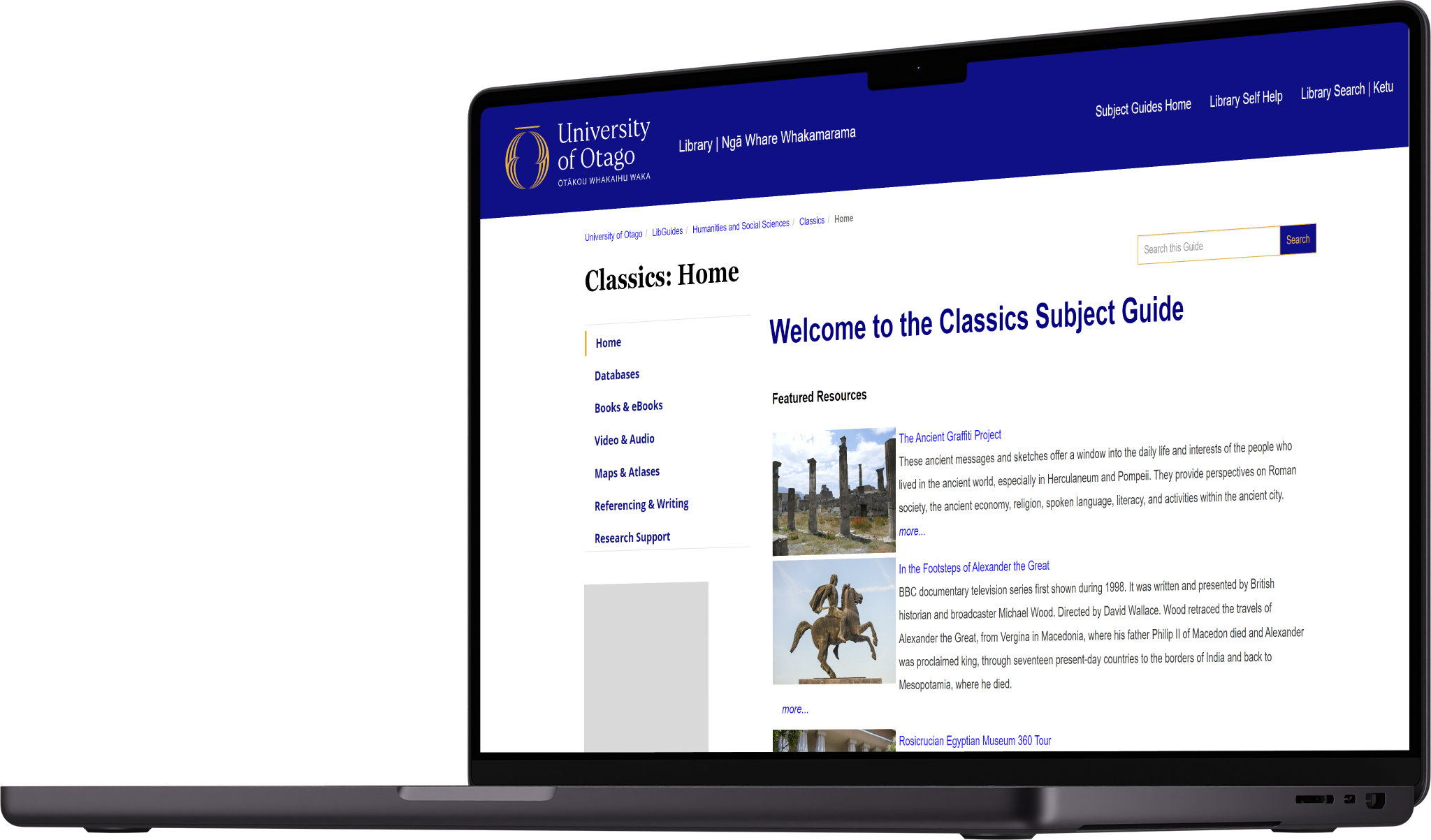
Testing coincided the University of Otago’s rebrand, which launched in May of 2024. The rebrand led us to adapt the brand-specific colours in a way that helped align the Subject Guides with existing university pages. This change resulted in the below designs for the homepage and individual guide pages.

Average Time on Task
28 seconds
Development
I used this opportunity to upskill in HTML and CSS, developing a custom header with links to the main University of Otago, university Library, and Library Search pages:

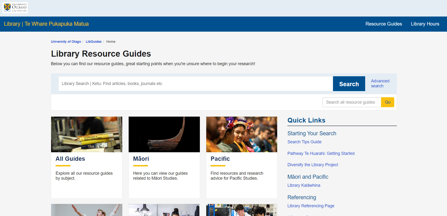
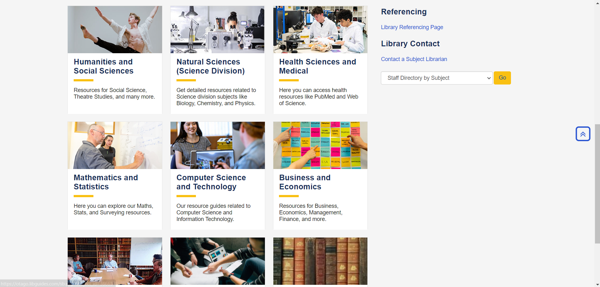
After some feedback from the Digital Delivery Manager, who recommended taking inspiration from the University of Auckland, I created content cards based on the different university subject divisions. The structure would make the landing page a more simplistic entry point for users:


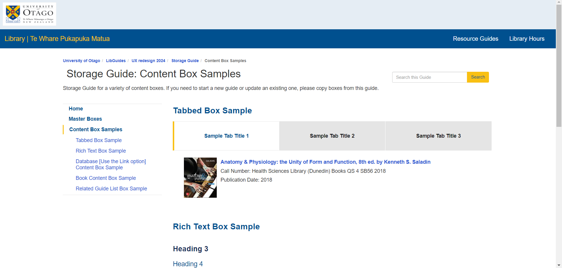
I also created custom CSS and a new HTML template for individual subject guides, like the sample Design guide below. This template moved the navigation from the top to the side, creating one column of content on the page to improve readability and simplify the interface.
Further, the new template makes use of Springshare’s tabbed content boxes, which allow users to filter different types of content. These content boxes enable the flexibility Librarians want, while decreasing cognitive load for student users.
This version included a direct integration of the Library’s Search bar into the system. While this decision was based on user data indicating that Library Search is a heavily-used feature, it took away from the core content (the Subject Guides), and counteracted a Library policy about linking to relevant content rather than duplicating content from other pages.
After another round of feedback from Library staff, we started thinking of ways we could optimise space on the landing page, leading to a high-fidelity prototype that we tested with users.
Usability Testing

Working in partnership with the Library’s Student Innovation Group as well as the Māori and Pacific Engagement Advisors, we drafted a plan for a remote moderated usability study for this design. The study cohort involved:
The final design streamlines the user flow and centralises the site contents into easily navigable columns. The site also makes resources designed for Māori and Pacific Students, like the Library Kaiāwhina service and the Ngā Upoko Tukutuku | Māori Subject Headings guide, easier to locate.
Further, the design modernises the existing Subject Guides site, without compromising on content or quality of information.
Finally, this project and vision were the result of a collaborative effort, with over 20 staff members and multiple students providing feedback and insight on features, prototypes, and visual design.
4 women
4 men
Including 2 Pacific students and 2 Māori students, and
1 student from the Otago Disabled Students Association.
Methodology
For this usability study we presented each participant with a series of tasks within a functional prototype, testing Time on Task - the amount of time each participant took to complete a given task - and Conversion Rate - the percentage of participants who completed a given task.
P 1’s and 0’s
Average Conversion Rate
96%
The usability study revealed no P0 issues with the system. However, users did have trouble navigating some dropdown menus because they didn’t have a visual identifier marking them as dropdowns.
Virtually all participants indicated that they frequently used Google Scholar, and requested that this be added as a quick link in certain sections. With confirmation that the system is functional and usable, we proceeded with preparing for release.
The Final Design


Brand Colors
Primary Color 1
Primary Color 2
Secondary Color 2
Container Color 1
Container Color 2
Next Steps
After completion of the project I provided Librarians with design documents with information on human-centred design best practices, so that they can keep guide displays both informative and stylish. The Library will also perform research and maintenance including:
A system usability survey inviting users to provide continuous feedback
Regular updates to ensure that the site is optimised for mobile and tablet
Collaborations between Librarians and Library Systems to edit information architecture and displays as needed

